

A year ago, we undertook the challenge to reimagine our reporting and analytical capabilities. We realized that Gainsight has an abundant wealth of data across multiple dimensions of customer engagement (like usage, billing, survey, support and implementation) yet we did not have an analytical tool versatile enough to encourage interactive exploration and discovery. Having the right data is only half the battle. It’s crucial that business leaders know what do with it.
We had a few goals in mind when we started off with our makeover project:
- Create a reporting tool that is simple to use and easy to understand for both technical and business users
- Yet it has the breadth and depth of features that makes it one of the most powerful reporting and analytical tools out there
- That guides users in exploring and using data for more informed decision-making
Early Wins
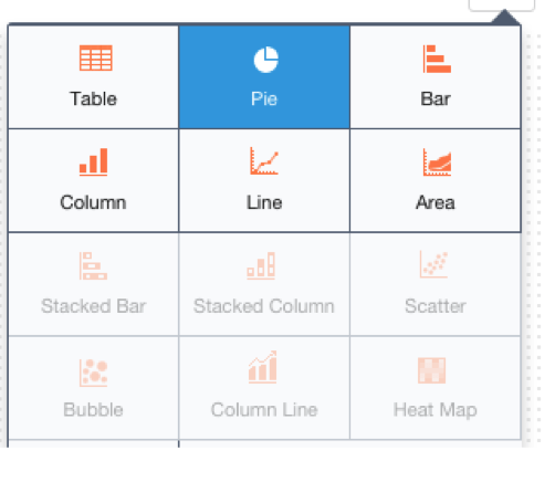
Some of the obvious limitations with our reporting functionality were easy victories. We quickly supplemented the rudimentary data representations such as pie, column and bar charts with sophisticated options such as bubble charts, scatter plots, heat map, stacked bars/columns, area graphs, and packed bubble.
At a more fundamental level, though, one of our primary design criterion was to create a tool so simple that it doesn’t take a BI expert to operate it. We had realized first-hand that if a reporting tool requires significant training hours, very few people in the organization could take full advantage of its capabilities. What is the net impact? Customers are intimidated, and the data is left unexplored. People who are “trained” on the reporting system become a bottleneck for access to data-driven insights in your organization.
The Epiphany for Simplicity
We wanted to build reporting tool that is intuitive and easy to use right from the get-go. Rather than creating a tool optimized for every scenario, we designed our reporting engine to break bottlenecks in information access and usability.
We set about by asking our customers the simplest question possible: “What are the most common questions you want your data to answer?”.
We collected hundreds of responses and gradually a pattern began to emerge. To our surprise, we realized that we could equate most questions to a “Show me ..by” construct:
- “I want to know my average customer health by revenue band” = Show me the average of Customer health by Revenue band
- “I want to know how is my revenue distributed across my CSMs” = Show me the sum of Revenue by CSMs
- “I want to know the Average NPS score and the number of customers across a customer segment” = Show me the average of NPS and the number of Customers by each segment
…and the list went on. This combination of aggregated data (Avg, Sum, Count, Max, Min) and the “Show me by” construct is robust in its simplicity and intuitiveness. It became the central theme of our design.
To improve intuitiveness of the tool or the Report Builder, as we call it, we also introduced the idea of auto-aggregation. Auto-aggregation is applied automatically to the measures based on their field type. For example, if a user adds “ARR” to “Show me” and “Industry” to “By”, we auto-aggregate the ARR as “Sum of ARR by industry”. The user doesn’t have to think through this and configure manually.
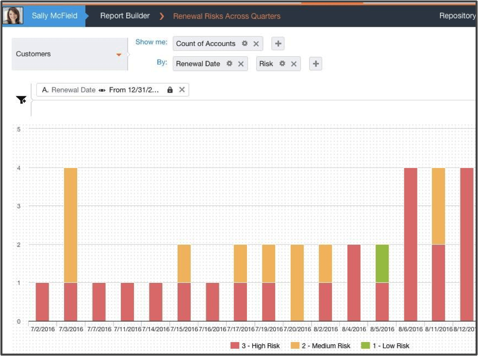
Take a look at the example below. There is an auto-aggregation at the ACCOUNT measure to show the number of accounts across different risk segments over a period of time.
Building for Flexibility
After discovering the design construct to build intuitiveness into our tool, we looked to tackle the issue of broad flexibility and access. We want to make the reports the admin builds perpetually available and relevant.
We started looking at the way we support our dashboards. Admins have the option to create dashboards that collate related reports into one page that is exposed to all end-users. These dashboards are an excellent way to present a rich perspective on multiple types of data relevant to a specific role or function (i.e., a dashboard for Executives, a dashboard for Product Requests and Risks).
However, these dashboards are limited in their usefulness as they are based on the predefined context and agenda for which they were created. As such, they may not remain relevant to the business question faced right now by the person viewing the dashboard.
This is where the concept of unlocked filters and dynamic ranking comes in. Unlocked filters are run-time filters that end-users can use to dynamically slice and dice the data in a chart. Ranking capability enables measures to be ranked on an aggregated field (such as sum and average) to view the top or bottom X data points on that aggregated measure.
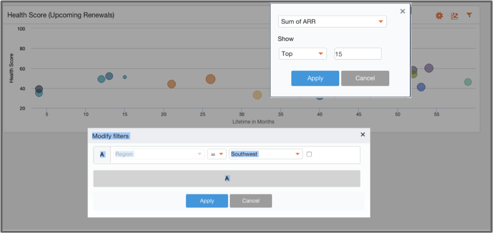
In the example below, I have created a filter on a chart to only show the upcoming renewals in the Southwest region. I can also rank them by their cumulative ARR to view the most or least valuable customers according to ARR. Each end-user can adjust these filters in their individual view of the report to answer their unique question for their data.
On the flip side, perhaps we don’t want all of our end-users to manipulate the data without limit. Maybe we want to ensure that there are some filters and constructs that remain in place to enforce permissions or guide users through the data.
Enter locked filters. Locked filters solved for enforcing user permissions and error avoidance. Admins can choose to lock certain filters to ensure that they can’t be manipulated during report consumption.
One example our customers shared is the need to enforce user permissions while viewing reports – a CSM should be able to see reports filtered on just her customers. In the example below, locked filters ensure that the CSM is not viewing any churned accounts (error avoidance), and the report is filtered for customers of the current user (permissions enforcement).

Making Insight Accessible
We also wanted to solve for the need to disseminate the information in these reports across multiple functions – people who are not the users of Gainsight but consumers of information captured in the reports (like the executive team). We, therefore, created an option to schedule emails to send a snapshot of a dashboard or report, filtered at the customer level and contact level.
As you invest in making your customers successful, demonstrating the value you are delivering is key. Doing so helps your customers drive adoption and justify their ongoing investment with you. By marrying our Reporting and customer email campaign functionality (CoPilot, as we call it), we have enabled our customers to do just that. With the option of scheduling emails personalized with pre-filtered user-engagement reports, we have given our customers the tools to communicate the value their customers are receiving.
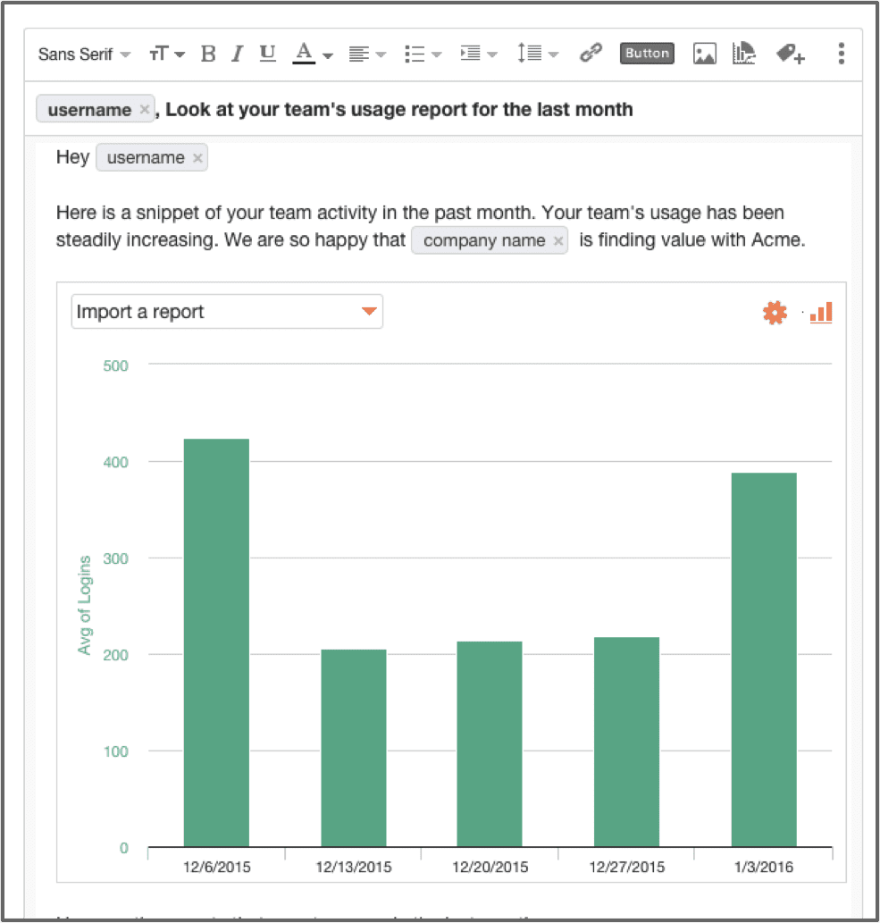
In the example below, we have created this personalized email with a usage report that is scheduled to be sent to all the customers (or a certain segment of them) who exhibit high usage pattern. Notice how tokenization has facilitated personalization. The reports can be filtered at a customer and contact level to ensure privacy. Here we have used usage data as an example but you can just as easily use survey, support or any other data indicative of customer engagement, that you bring into Gainsight.
The new Report Builder, in essence, brings analytics back to the hands of the user. No hassle, and no more waiting around for IT or BI analysts. The insights from the customer data and the ability to act on those insights are right at your fingertips. So whether you are an Account Manager trying to spot churn trends or an Executive looking to monitor performance of her team or a Services Manager wanting to analyze NPS scores post implementation, Gainsight’s Report Builder gives you the expertise to get you on your way.
