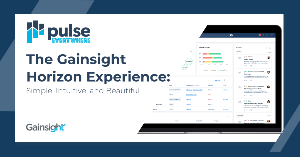

We are extremely excited to have announced the Gainsight Horizon Experience at Pulse Everywhere. Our goal is to deliver a product experience that is simple, intuitive, and beautiful, without sacrificing any of the power you need and expect from Gainsight.
These values – simple, intuitive, and beautiful are not just buzzwords. They drive every idea, component, and screen we deliver – so much so that I guarantee every member of the design team is having dreams (or nightmares) about them these days 😉
Let’s take a closer look at what these mean and how you can apply them to your own work.
Simple
“Feedback is a gift” Ah yes, the old mantra we know and love; and is especially prevalent when working on a design. We source feedback on new concepts, designs in progress, and have already delivered work through various sources including in-app feedback, usability testing, and the usage data we capture in Gainsight PX.
A lot of our survey feedback indicated that our users struggled to find things across Gainsight. They mentioned a lot of trial and error, navigating through many pages, and ultimately getting lost in our product.
When we began the reimagination of Cockpit, we took a deeper look at what this feedback might mean. When we analyzed our navigation using Gainsight PX, we found that an overwhelming percentage of users would land in the cockpit, but then quickly navigate to the customer detail page, only to navigate back to Cockpit and so forth.
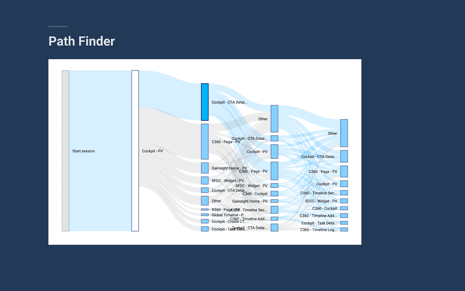
Click Path Analysis From Gainsight PX
After experimenting with several solutions, we decided to
- Create a standard where record details would open inline across all of Gainsight, so the user could stay in the context of their work when looking for additional details
- Add much more important information to the company tab and made the pane wider, so the information was easy to read.
- Add an inline hover on the account name within lists so the user could see important information at a glance, such as NPS, ARR, and Health Score.
- Resolve the relevancy challenge by adding quick, intuitive filters based on what users care about most such as: due soon, upcoming renewals, and customers at risk.
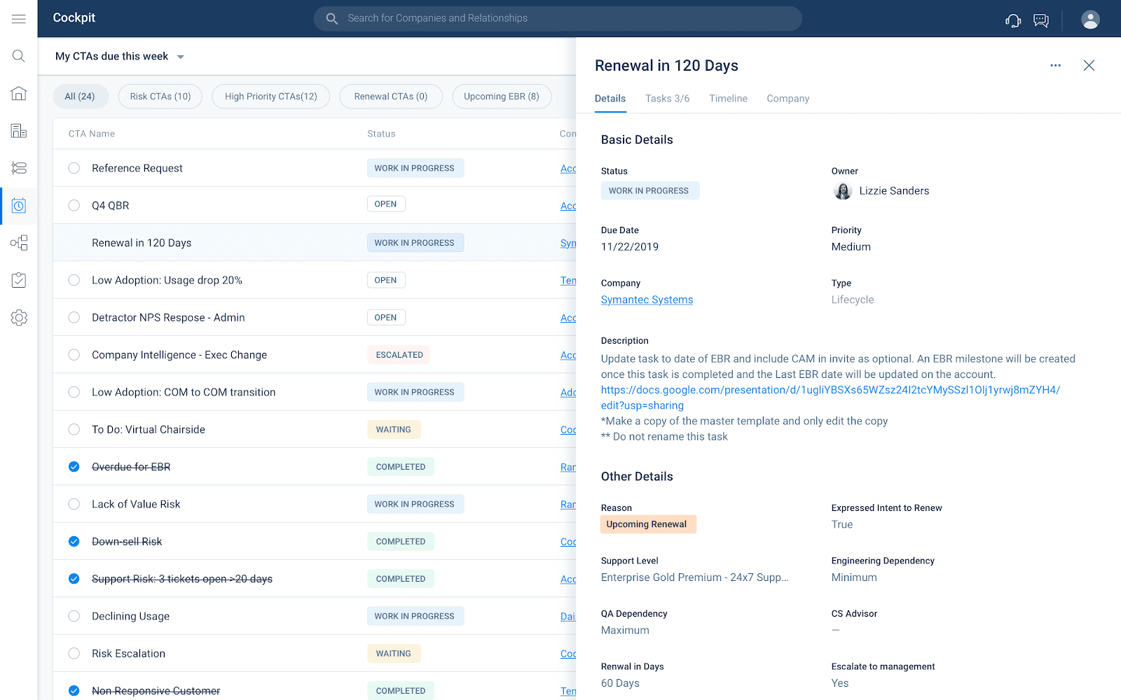
Cockpit in Horizon Experience – ETA Summer 2020
Beyond Cockpit, here are some of the main principles we consider when ensuring our design is simple.
- Clear primary action: The user should know within one second where they are supposed to click to create or edit content.
- 3 choice maximum: Numerous studies have shown that when people are presented with more options, their ability to make a decision dramatically decreases. Secondary or tertiary actions are moved to a “kebab” menu, allowing access only when needed or by advanced users.
- Decrease navigation fatigue: Can the page a user is going to be opened inline, instead of somewhere else? In most cases of SaaS and Productivity applications, it can. We have focused on the pattern of exposing information through a 3rd pane, which makes it much easier to display consistently in our app, but has the added benefit of making us design for small spaces, excellent for mobile and email plugins.
- Eliminate most icons: Icons are great when they are used to convey a concept with universal meaning. But often, they are placed next to a button that already has a clear call to action. Or worse, they are placed alone but are not a universal concept and therefore need a text description. Think about all of your icons— if they can’t convey meaning when standing alone, consider eliminating them. Next, see if your buttons and lists can do without them. You’ll be amazed by what you find.
Intuitive
Think of the last time you struggled to use a software application or a website…
I bet that it didn’t take long. Likely, the functionality is all “there” but you didn’t know how to use it. Now you’re frustrated, and the company you’re interacting with is losing business because you left the app or even worse, told others about your negative experience.
The software wasn’t intuitive. What do I mean by this? Users should always know where they are, why they’re there, and what to do. And the information surfaced to them needs to be relevant, without any initial user configuration.
A great example of this is the quick filters I mentioned in Cockpit. In fact, these are also exposed in Timeline and many other areas of the admin section of Gainsight. But I want to dive in on another improvement we made to help you find value with Gainsight more quickly: Scorecards.
A Scorecard is a great way to customize the health of your customers by placing custom weights on different measures. There is also a concept called “measure groups” that let users organize those measures by topic. In Gainsight’s legacy Scorecard Configuration module, there were several challenges. First, the system let users exceed 100% and recalibrated the values in the scorecard to correspond to the new overall percentage. Smart, but unclear. Secondly, although a user clicked submit, the user once again had to click save for the action to be completed, which was often missed. Thirdly, if a scorecard has measure groups, the user has to try some very interesting hacks to set a weight on a specific measure. In this example, the user wants “Breadth of Adoption” (DEAR) to be weighted at 90% of the overall score, and to do so they must assign a weight of “810” to the measure.
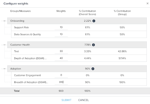
Gainsight Legacy Scorecard Configuration
In the Horizon Scorecard Configuration Experience, a great focus has been placed on helping the user to understand and more easily manage their measures. First, they are given a larger canvas to work through, so the focus is clear. Next, they are provided with microcopy and instructions to guide through the experience. But arguably the most important move toward a more intuitive configuration is adding clarity to measurements.
Now, admins are able to assign weights to measure groups. All measures within the group now roll up to that group’s total. So, if measure group A is worth 50% of the overall contribution, and a measure within that group is worth 50% of that group, the measure will result in 25% of the scorecard’s total. The admin may also set overrides as they can today, at not just the measure level, but also the group level. For example, if a group falls below a certain threshold, such as product usage, the admin can decide to turn the overall score red, even if other signals are green.
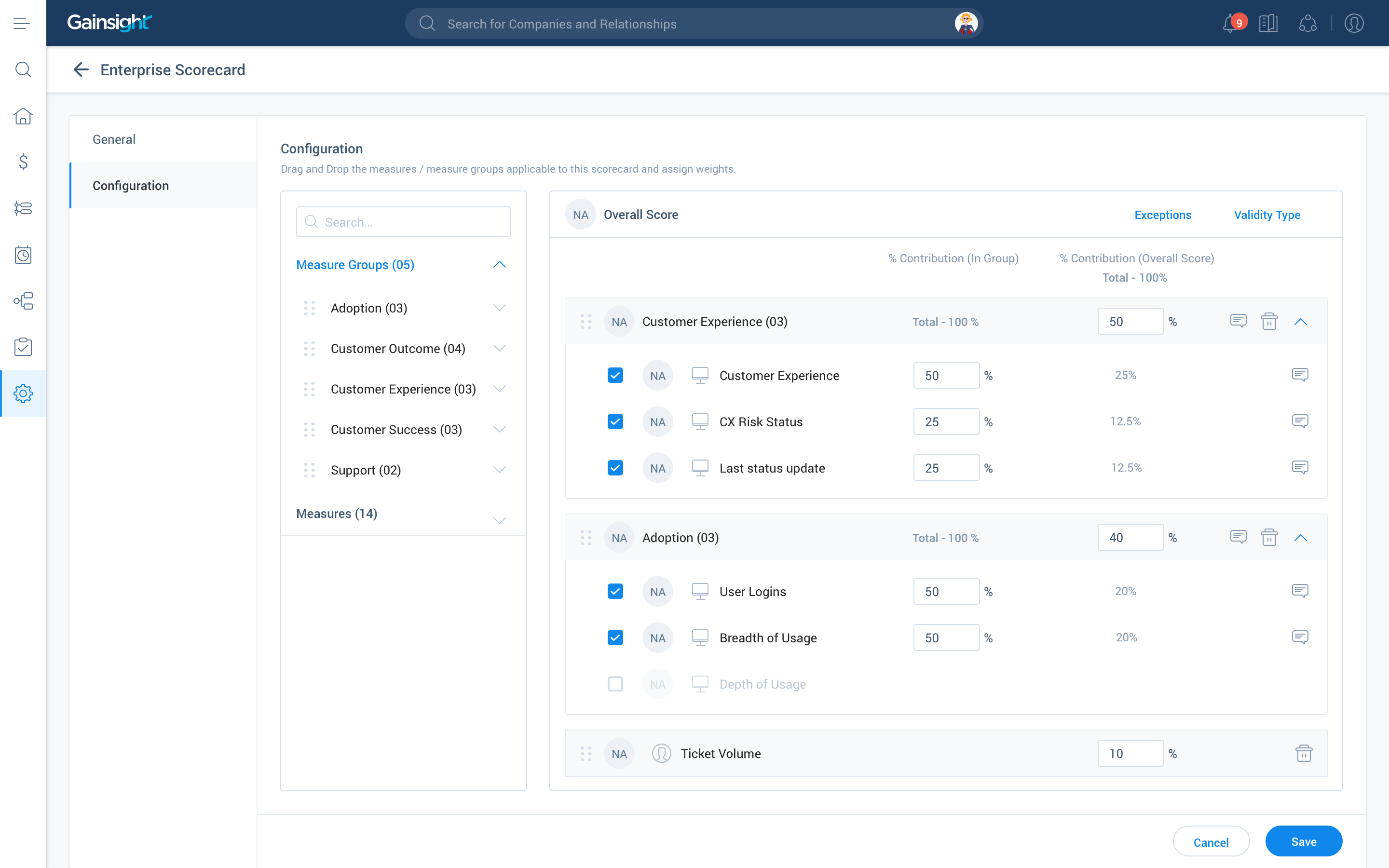
Scorecard Configuration in Horizon Experience – ETA Summer 2020
Beautiful
Of course, good design is supposed to be aesthetically pleasing, but did you know that users of beautiful applications actually perceive them to be more usable? The Aesthetic-Usability Effect states that people tend to believe things that look better will work better — even if they aren’t actually more effective or efficient.
One user encountered many issues while shopping on the FitBit site, ranging from minor annoyances in the interaction design to serious flaws in the navigation. She was able to complete her task, but with difficulty. However, in a posttask questionnaire, she rated the site very highly in ease of use. “It’s the colors they used,” she said. “Looks like the ocean, it’s calm. Very good photographs.” The positive emotional response caused by the aesthetic appeal of the site helped mask its usability issues. – Nielsen Norman Group Usability Study, 2017
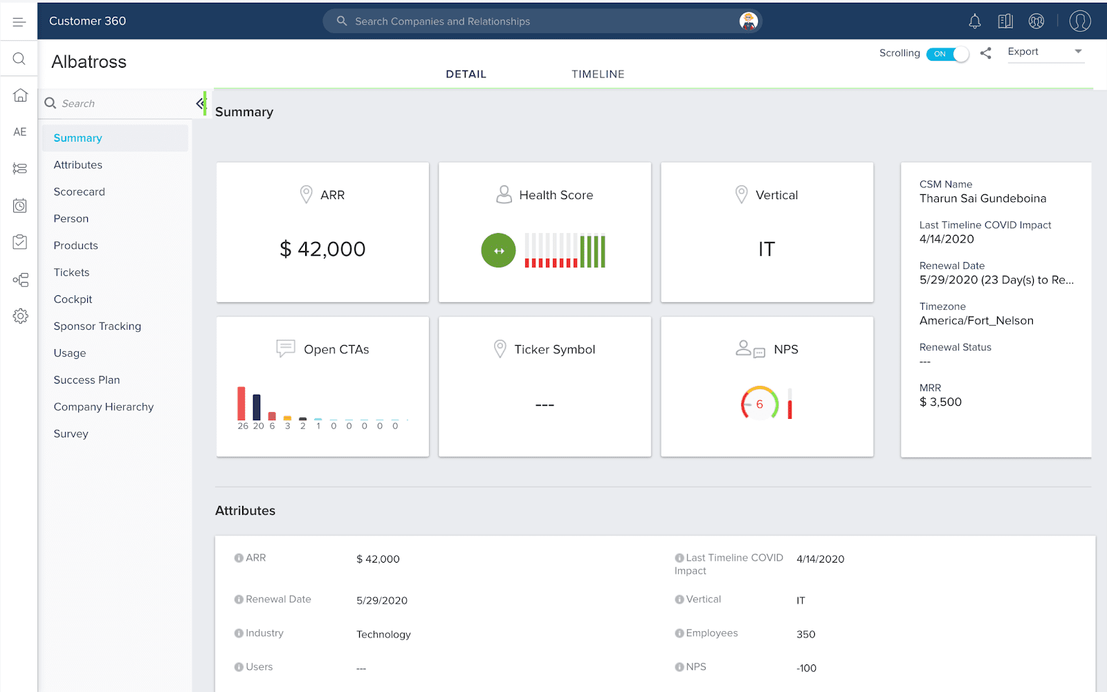
Current Customer 360
I probably don’t need to spend much time convincing you that more beautiful is better than less beautiful. So let me go ahead and show you.
Customer 360 is a detailed record that provides insight into a customer, their interactions, and their usage.
With so many sections, the 360 view becomes difficult to navigate quickly. Also, without consistent visual styling, it’s difficult to understand the meaning of one module compared to another.
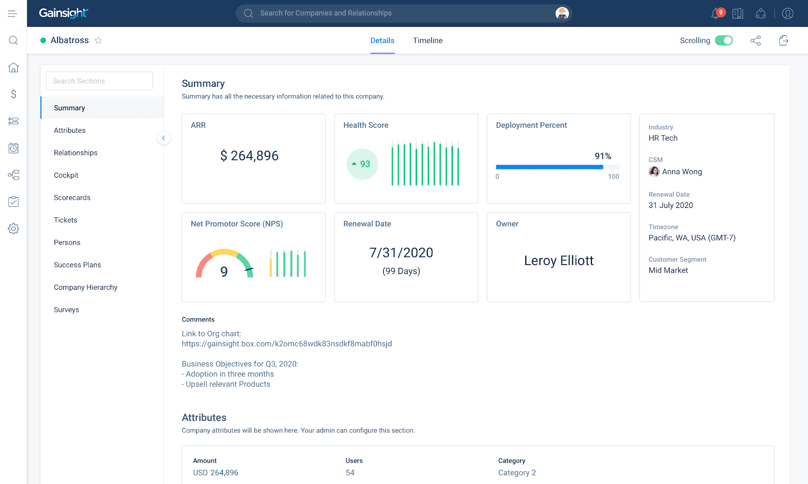
Customer 360 in Horizon Experience – ETA Summer 2020
In Gainsight’s new 360, you can see many of the visual patterns we are implementing across all of our applications:
- Light, breathable layout with generous whitespace
- Soft, muted colors so the user still understands the signals without being overwhelmed
- Slightly lower color contrast to avoid eye strain
- Consistent font, font color, and weights
- Modern, flat iconography and visualizations
In conclusion, we chose simple, intuitive, and beautiful because they are most important to our customers. If you go through this exercise, think about your top business problems and see which values align with it.
We’re really looking forward to launching the entire Horizon Experience over the next few quarters. What do you think about it? Share your feedback with your CSM!